Create a Pulsing "Live" Indicator in SwiftUI
Create a Pulsing "Live" Indicator in SwiftUI
Sometimes you need to show users that data is live and updating without being obnoxious about it. A subtle pulsing animation on a "Live" badge is perfect for this—it catches the eye just enough to communicate "this is real-time data" without screaming for attention.
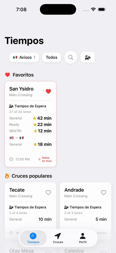
I built this indicator for Border Times, an app that shows real-time border crossing wait times. We needed to communicate that the wait times people were seeing were actually live, posted by real users in the last few minutes.
Here's how to build a simple, reusable pulsing indicator in SwiftUI.
The Basic Animation
The core concept is simple: we'll use @State to drive an animation that repeats forever, scaling and fading a circle behind a "Live" label.
struct PulsingLiveIndicator: View {
    @State private var isPulsing = false

    var body: some View {
        HStack(spacing: 6) {
            ZStack {
                // Pulsing circle
                Circle()
                    .fill(Color.red.opacity(0.3))
                    .frame(width: 12, height: 12)
                    .scaleEffect(isPulsing ? 1.4 : 1.0)
                    .opacity(isPulsing ? 0 : 0.3)

                // Static dot
                Circle()
                    .fill(Color.red)
                    .frame(width: 8, height: 8)
            }

            Text("Live")
                .font(.system(size: 13, weight: .medium))
                .foregroundColor(.red)
        }
        .onAppear {
            withAnimation(
                .easeInOut(duration: 1.5)
                .repeatForever(autoreverses: false)
            ) {
                isPulsing = true
            }
        }
    }
}
Breaking It Down
The State Variable
@State private var isPulsing = false
This boolean drives our animation. When it's false, the pulsing circle is at normal size and opacity. When it's true, it scales up and fades out.
The Two Circles
We use two circles layered in a ZStack:
- The outer circle pulses (scales and fades)
- The inner circle stays static as a solid dot
This creates a radar-like effect where the pulse emanates from a fixed point.
The Animation
.onAppear {
    withAnimation(
        .easeInOut(duration: 1.5)
        .repeatForever(autoreverses: false)
    ) {
        isPulsing = true
    }
}
When the view appears, we trigger an animation that:
- Takes 1.5 seconds to complete
- Uses
easeInOutfor smooth acceleration/deceleration - Repeats forever without reversing (keeps pulsing outward)
By setting isPulsing = true inside the withAnimation block, SwiftUI automatically animates all the properties that depend on isPulsing—in our case, the scaleEffect and opacity.
Making It Reusable
To make this more flexible, you can add parameters:
struct PulsingLiveIndicator: View {
    @State private var isPulsing = false

    var color: Color = .red
    var text: String = "Live"
    var pulseDuration: Double = 1.5

    var body: some View {
        HStack(spacing: 6) {
            ZStack {
                Circle()
                    .fill(color.opacity(0.3))
                    .frame(width: 12, height: 12)
                    .scaleEffect(isPulsing ? 1.4 : 1.0)
                    .opacity(isPulsing ? 0 : 0.3)

                Circle()
                    .fill(color)
                    .frame(width: 8, height: 8)
            }

            Text(text)
                .font(.system(size: 13, weight: .medium))
                .foregroundColor(color)
        }
        .onAppear {
            withAnimation(
                .easeInOut(duration: pulseDuration)
                .repeatForever(autoreverses: false)
            ) {
                isPulsing = true
            }
        }
    }
}
Now you can customize the color, text, and pulse speed:
// Red "Live" indicator
PulsingLiveIndicator()

// Green "Online" indicator
PulsingLiveIndicator(color: .green, text: "Online")

// Faster blue pulse
PulsingLiveIndicator(color: .blue, pulseDuration: 1.0)
Real-World Usage
In Border Times, we show this indicator next to wait times that were recently posted by users. It's a subtle but effective way to communicate freshness and build trust that the data is actually real-time.
The beauty of this approach is how simple it is. No external dependencies, no complex animation curves—just @State, scaleEffect, opacity, and repeatForever. SwiftUI handles all the interpolation for you.
Try It Yourself
Drop this code into a SwiftUI preview and play around with the parameters:
- Change the
scaleEffectmultiplier to make it pulse larger or smaller - Adjust the
opacityvalues to make it more or less subtle - Try different colors and durations to match your app's design
What I love about this approach is how little code it takes to build something that actually feels polished. No animation libraries, no complicated easing curves—just a couple of modifiers and SwiftUI does all the heavy lifting. When I first built this for Border Times, I expected to spend an afternoon tweaking timing curves. Instead, it worked perfectly on the first try and I moved on to the next feature.
I built this for Border Times, an app that helps people avoid long waits at the US-Mexico border by showing real-time crossing times from actual users. If you cross frequently, give it a try at border-times.com/s/cgjtwv.