SwiftUI Patterns
Animating Grid/List Mode Transitions
June 3, 2026
4 min read
Toggle between grid and list views with smooth animations. Here's the pattern for switchable layouts.
Follow along with the code: iOS-Practice on GitHub
The Toggle Pattern
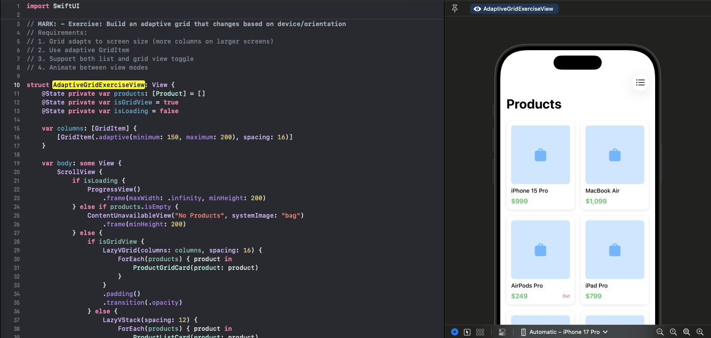
struct AdaptiveGridExerciseView: View {
    @State private var products: [Product] = []
    @State private var isGridView = true

    var columns: [GridItem] {
        [GridItem(.adaptive(minimum: 150, maximum: 200), spacing: 16)]
    }

    var body: some View {
        ScrollView {
            if isGridView {
                LazyVGrid(columns: columns, spacing: 16) {
                    ForEach(products) { product in
                        ProductGridCard(product: product)
                    }
                }
                .padding()
                .transition(.opacity)
            } else {
                LazyVStack(spacing: 12) {
                    ForEach(products) { product in
                        ProductListCard(product: product)
                    }
                }
                .padding()
                .transition(.opacity)
            }
        }
        .animation(.easeInOut, value: isGridView)
        .toolbar {
            ToolbarItem(placement: .topBarTrailing) {
                Button {
                    isGridView.toggle()
                } label: {
                    Image(systemName: isGridView ? "list.bullet" : "square.grid.2x2")
                }
            }
        }
    }
}
Key Components
1. State Toggle
@State private var isGridView = true
2. Conditional Layout
if isGridView {
    LazyVGrid(...)
} else {
    LazyVStack(...)
}
3. Animation
.animation(.easeInOut, value: isGridView)
4. Transitions
.transition(.opacity)
Toolbar Toggle Button
.toolbar {
    ToolbarItem(placement: .topBarTrailing) {
        Button {
            isGridView.toggle()
        } label: {
            Image(systemName: isGridView ? "list.bullet" : "square.grid.2x2")
        }
    }
}
The icon shows the alternate view mode.
List Card Design
struct ProductListCard: View {
    let product: Product

    var body: some View {
        HStack(spacing: 12) {
            RoundedRectangle(cornerRadius: 8)
                .fill(Color.blue.opacity(0.2))
                .frame(width: 60, height: 60)
                .overlay {
                    Image(systemName: "bag.fill")
                        .foregroundColor(.blue.opacity(0.5))
                }

            VStack(alignment: .leading, spacing: 4) {
                Text(product.name)
                    .font(.headline)

                Text(product.description)
                    .font(.caption)
                    .foregroundColor(.secondary)
                    .lineLimit(1)

                Text("$\(product.price, specifier: "%.0f")")
                    .font(.subheadline)
                    .foregroundColor(.green)
            }

            Spacer()

            if product.inStock {
                Image(systemName: "checkmark.circle.fill")
                    .foregroundColor(.green)
            }
        }
        .padding()
        .background(Color(.systemBackground))
        .cornerRadius(12)
        .shadow(color: .black.opacity(0.1), radius: 4, y: 2)
    }
}
Alternative Transitions
// Fade
.transition(.opacity)

// Slide
.transition(.slide)

// Scale
.transition(.scale)

// Combined
.transition(.opacity.combined(with: .scale))
Interview Tip
This pattern shows understanding of:
- Conditional view rendering
- Animation modifiers
- Toolbar customization
- Consistent data across different presentations